Branding Agency Sydney – Marketing, Advertising & Branding Agency
Australian company Attic were seeking a branding agency. They had an existing brand identity in the form of a logo that they wanted to retain, yet refresh. This was the beginning of the marketing and advertising design partnership with Percept as the branding agency in Sydney.
The design of their branding, marketing and advertising material was outdated, ad-hoc in look and at times not targeted. Branding agency, Percept, worked with their in-house marketing team to devise a well positioned and effective communications plan for all their branding, marketing and advertising collateral by using a well thought out brand identity system to suit their specific requirements across all these areas.
Employed as their full-service branding agency, Percept, was also required to develop a brand positioning, brand strategy, brand architecture and brand identity system that would transition this Australian company from a specialisation in just ladders to other areas of growth such as skylights and storage areas.
The result was the creation of Attic Group as the mother-brand with divisions for the various services that sit underneath that umbrella as sub-brands.
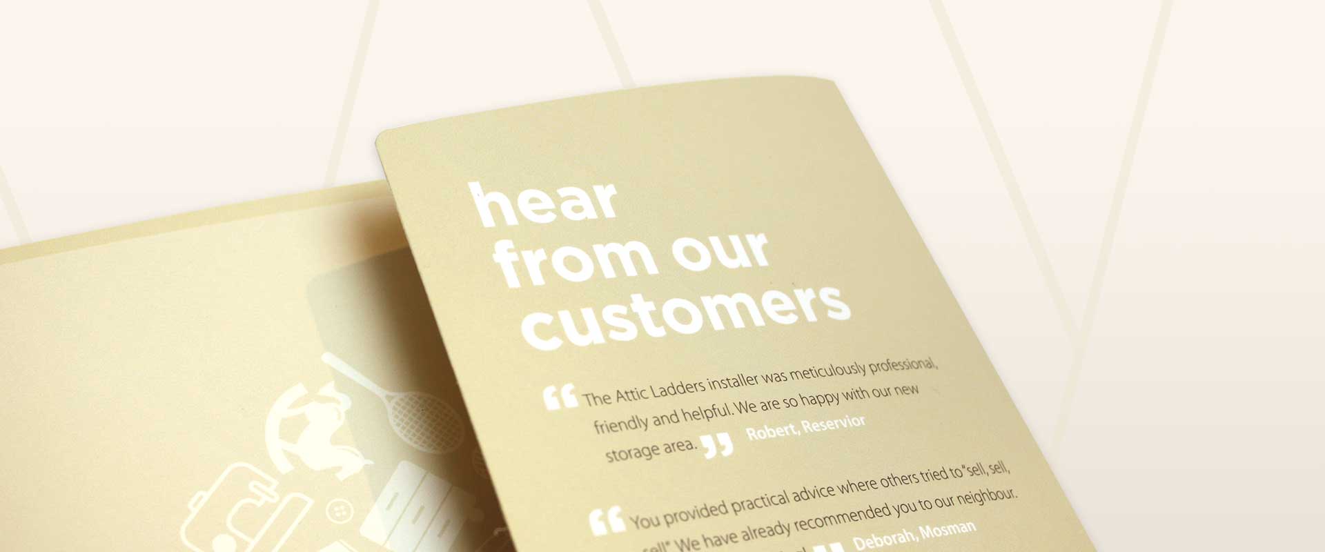
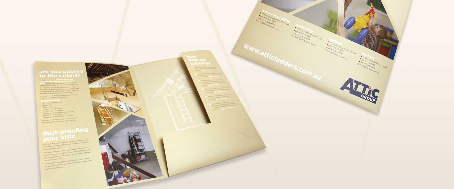
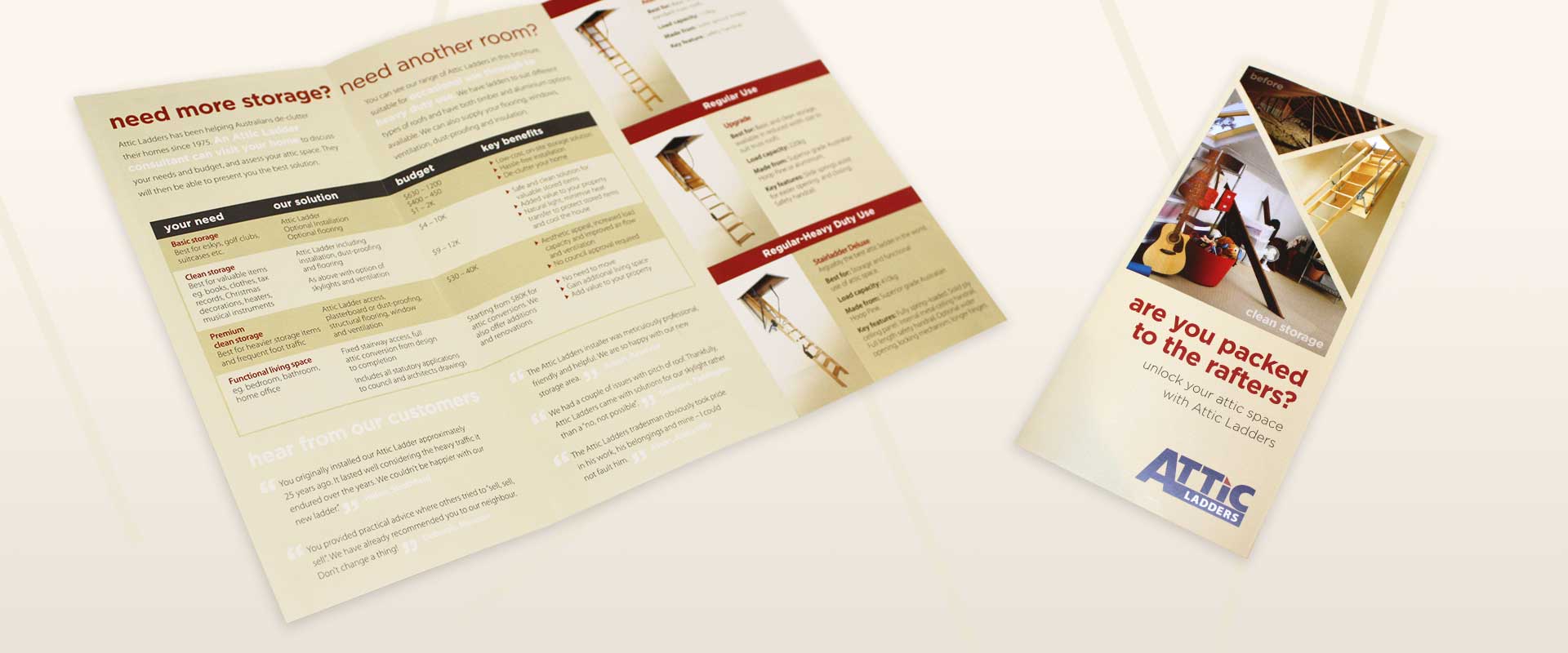
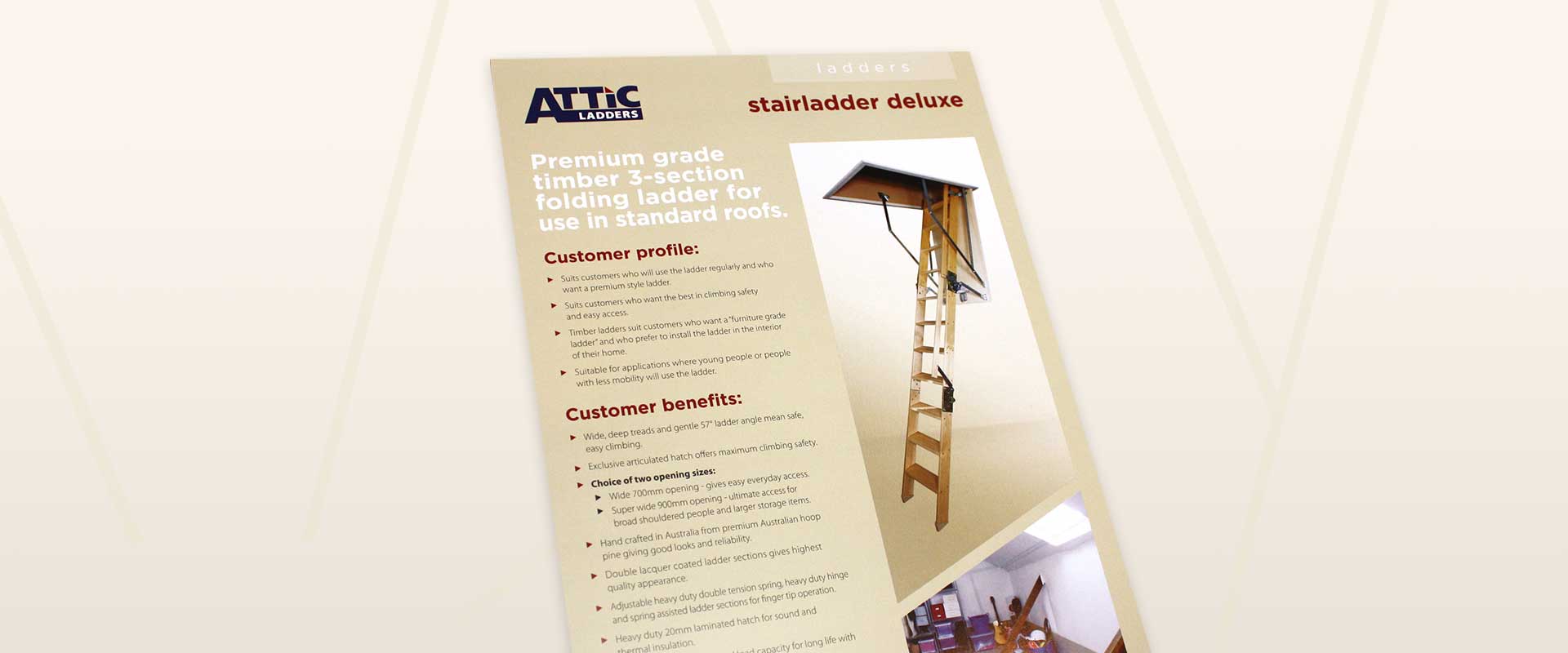
Percept is a branding agency in Sydney. Percept created a brand identity system to work across all their branding, marketing and advertising collateral that colour coded each division.
The brand identity system uses a consistent colour palette at brand level and distinguishes each service with a highlight colour.
A combination of quirky line-art illustrations and real photography creates a look and feel that is unique to the Attic company and when used in marketing and advertising, is clearly recognised amongst their competitors because of the distinct branding.
Branding agency, Percept, also chose to use angled picture containers to allude to their clever space saving work within attic areas. This adds to their unique brand identity design, at the same time as showing before and after visuals to quickly demonstrate to potential customers the benefits that Attic Group can provide.
If you are interested in brand identity design, look no further than full-service branding agency Sydney – Percept.