Branding / Vehicle Livery Design
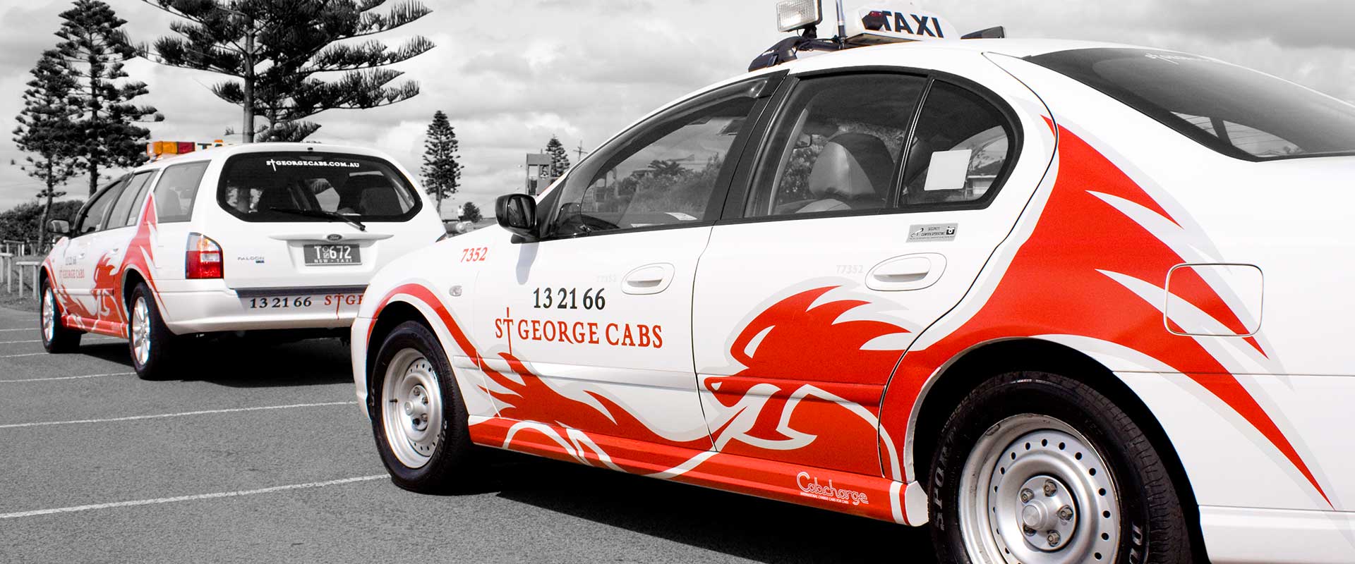
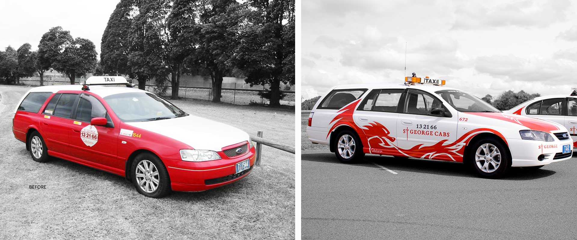
The St George Cabs fleet operates throughout Sydney’s metropolitan area. They had a brand image which appeared dated and wanted a re-vamp of their branding and vehicle livery design to gain attention and increase brand recognition.
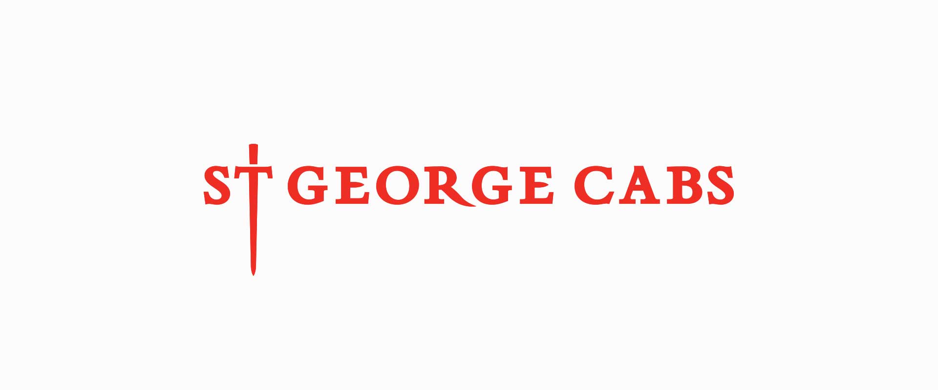
Design agency, Percept, approached the project beginning with the logotype, giving it a clean and simple look, bringing it into line with more contemporary branding.
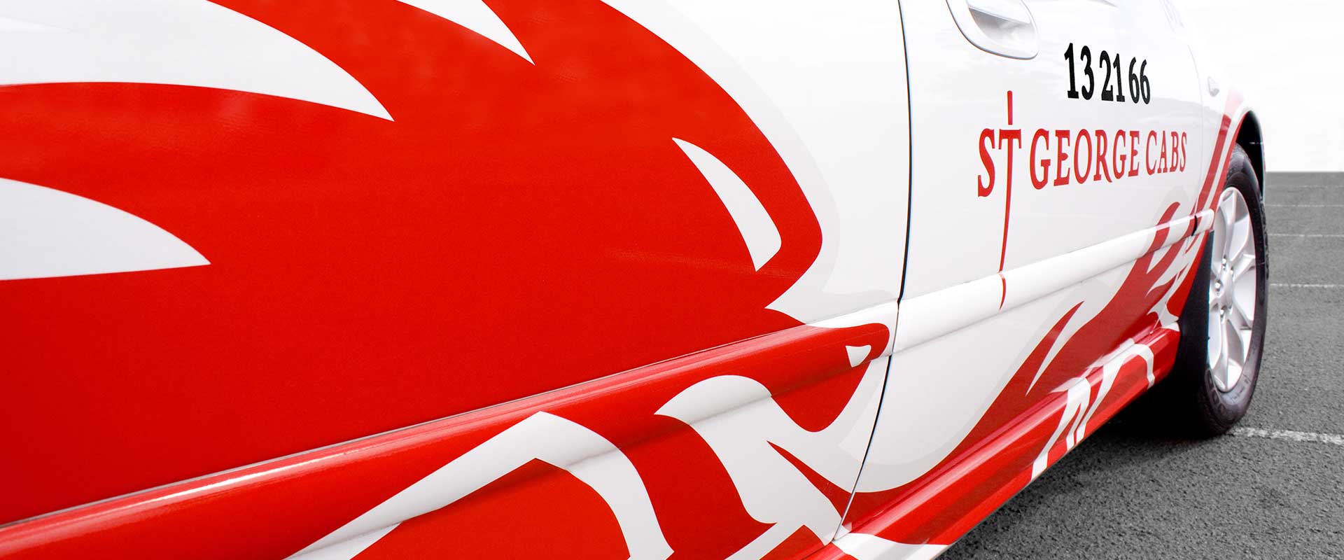
Based on the legend of St George and the dragon, a simple wordmark using a serif font to give the logotype design a sense of history, was used. The ‘T’ was then modified to create a subtle stylised sword.
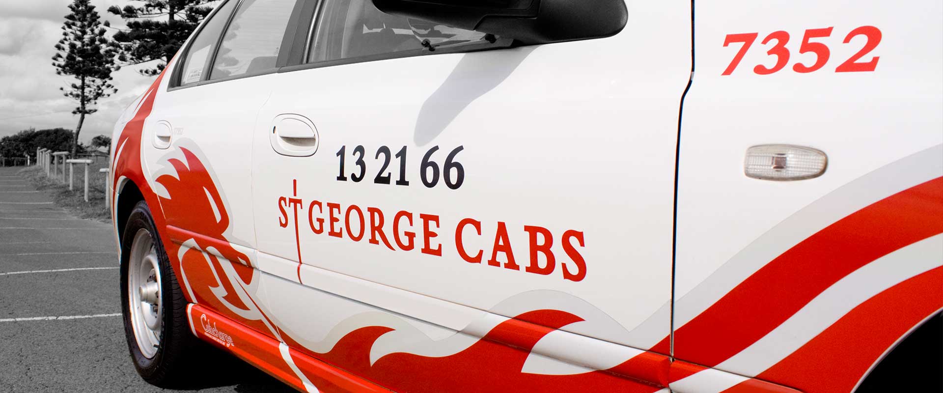
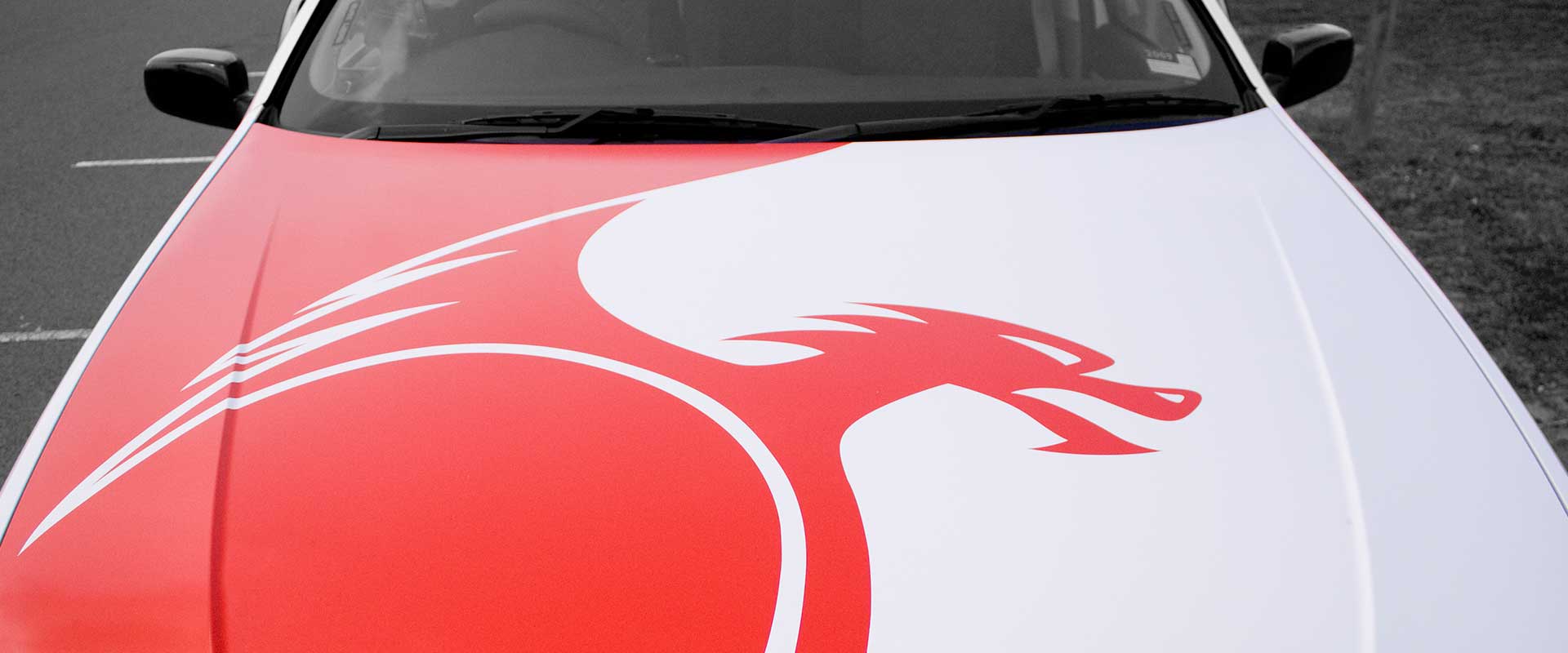
The next stage in the branding process moved on to the vehicle wrap which featured a stylised dragon breathing fire across the side of the cabs, creating highly engaging graphics which had instant impact and improved brand recognition on Sydney’s busy roads.
A reflective vinyl has also been used so whether it’s day or night, the new design is a real head turner!
We would like to commend the St George Cabs board, who, when presented with a variety of concepts on this branding and vehicle livery design project, were brave enough to branch away from the conservative and run with a more risky, yet more rewarding choice for their new branding.