

Branding & Vehicle Livery Design
Travellers Autobarn chose Percept in Sydney for their branding and vehicle livery design. With the vast majority of their customers being backpackers, it was to appeal to the international youth market that travel all over Australia, as they are their main customers.
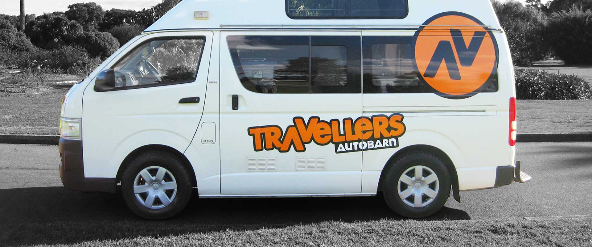
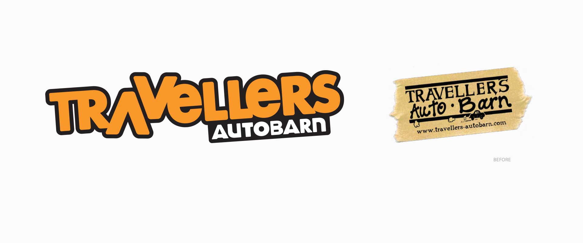
Percept created the branding to clearly communicate this long name. We identified an opportunity to use the A and V as directional arrows to visually gesture the travelling theme.
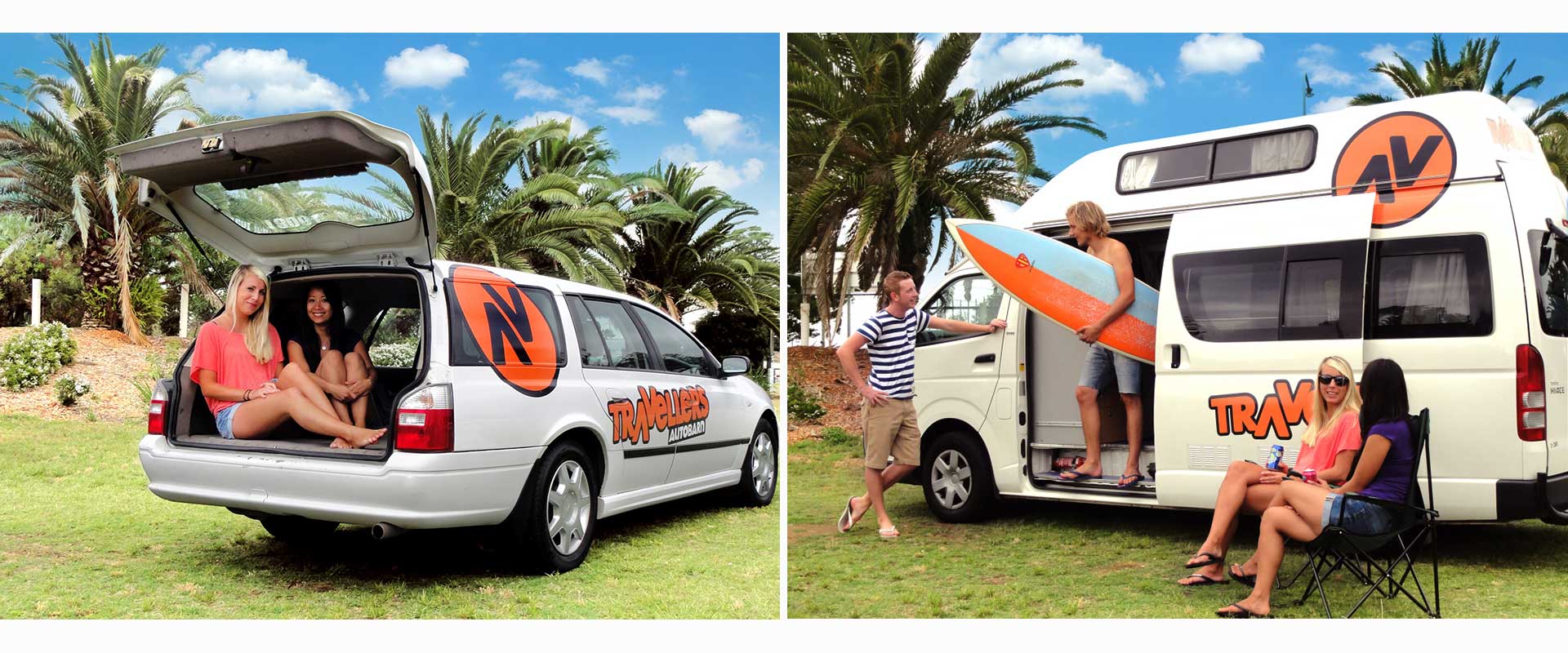
This concept was enhanced further by lifting that element and making it a circular icon to represent the brand. This technique is similar to the way many modern surf companies brand themselves which is very familiar to the majority of Travellers Autobarn audience. Many of whom are part of the modern youth surf culture themselves and this is what brings them to Australia in the first place.
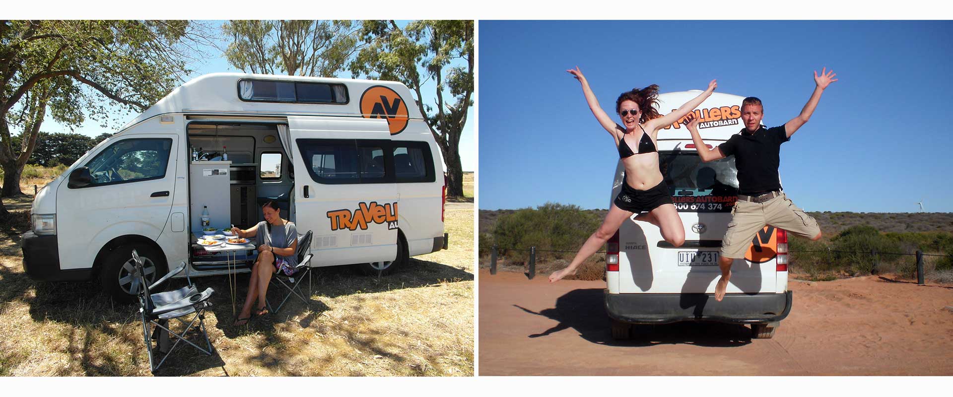
Branding design experts, Percept, aimed to achieve as much consistency as possible with the livery of the fleet which ranges across a variety of vehicle types.
The main two branding devices were the logotype and the icon, which we designed in only a couple of key sizes to keep signage production costs to a minimum. Consistency of placement made for a strong image across the fleet.
The new branding and vehicle livery design is clear and memorable, providing great bang for their buck.
The most important part of this branding and vehicle livery design project was getting their brand positioning correct.
In the backpacker campervan hire market, their is a vast array of choice. From the cheap and cheerful to expensive and reliable and everything in between.
Percept recommended the brand positioning for Travellers Autobarn to be one of a trusted company who were professional to deal with that consistently provide reliable vehicles.
This brand strategy was balanced with a youth appeal that was not too corporate in feel that said to its customers that Travellers Autobarn understand them and also offered great value for money.
We also wanted to show that they have extensive experience in the backpacking market for travellers throughout Australia.
Travellers Autobarn’s previous branding and vehicle livery design was inconsistent in style and didn’t utilise the real estate on each vehicle in the best possible way.
As the new signage has been rolled out, these issues have been addressed and they are finding that the new branding design is connecting better with their target market whilst providing much more awareness of their name due to the clarity of the new branding.