Packaging Redesign by Percept Design Branding
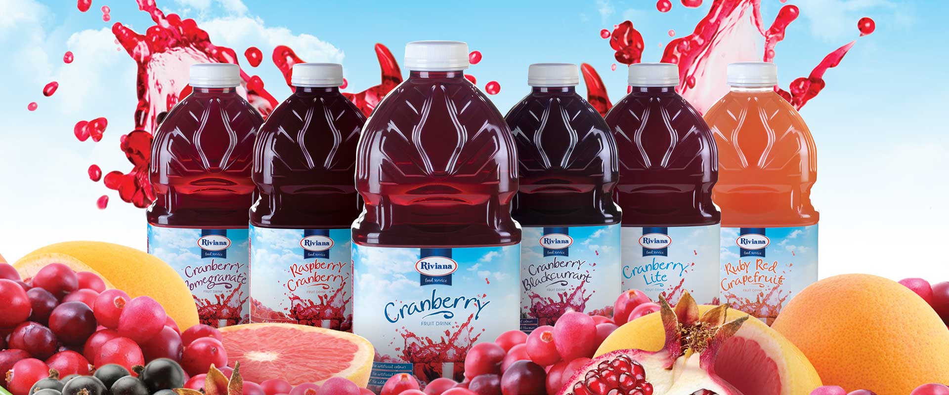
Riviana Foods approached Sydney design branding agency Percept for their packaging redesign project. The new label design style was then rolled out across their entire range of food products, which are aimed at professional chefs.
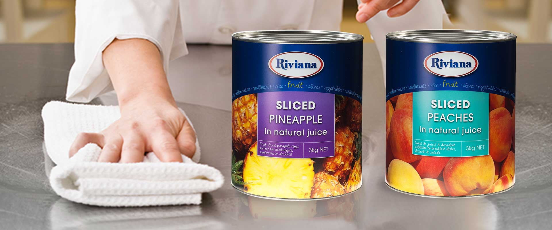
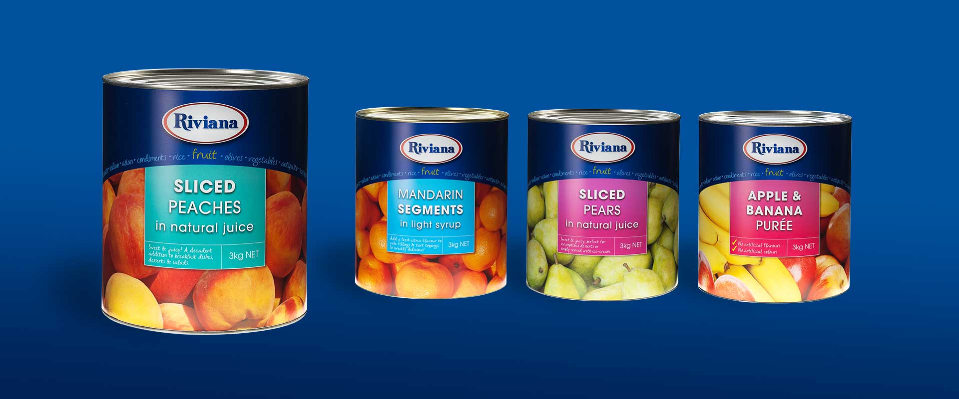
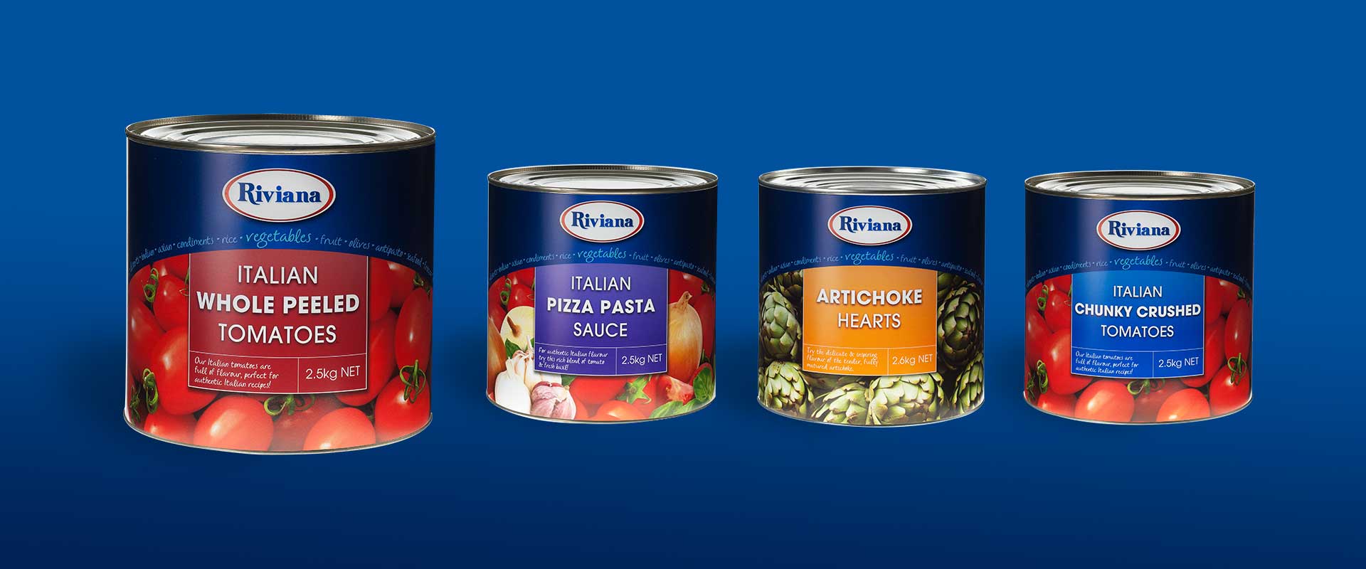
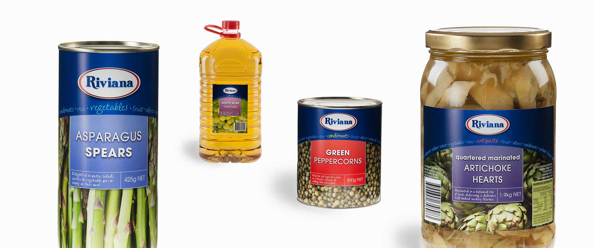
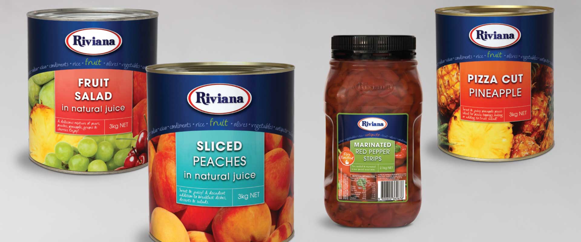
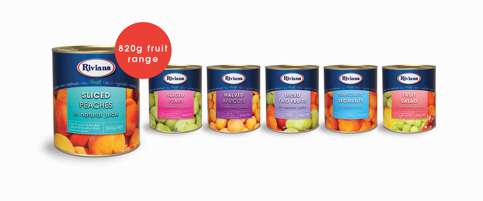
It was felt that Riviana’s old packaging design was dated and did not do justice to the quality of their food products because they used flat illustrations. As a result, we believed that it was important from a strategic point of view that appealing photography was used in the packaging redesign to depict the contents of the pack in a more appetising way.
A strong result was reached with the packaging redesign by using this photography as a large background image to increase the visual impact of each label design. Of even higher importance, it made for quicker product recognition when the packaging redesign is actually in use in a busy foodservice kitchen. Chefs can now find exactly what they want, when under pressure in their high-paced environment.
This ease of identification is also enhanced by the clear communication design of the product name in a concise and easy to read colour coded panel.
The Riviana design branding was also addressed with the use of a consistent dark blue panel at the top of each label which contains the refreshed logo. This helped to improve recognition of the design branding as requested as part of the packaging redesign brief.
The same area is also used to define the product category that the food product belongs to, whilst informing the user of the other categories that Riviana offer.
Since the launch of the packaging redesign, Riviana informs us that the new design branding has been working very well for them!