Branding & Packaging Design
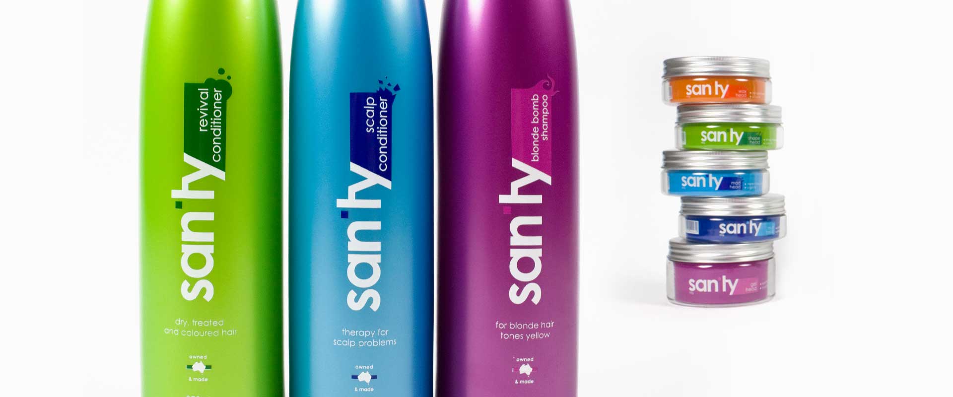
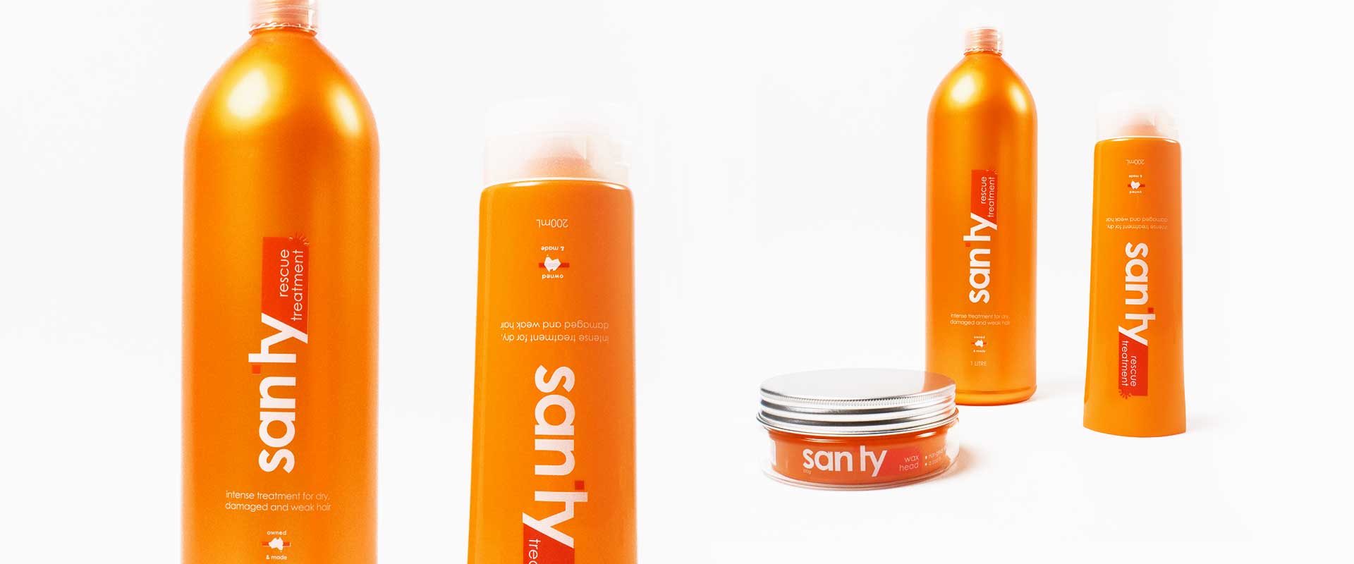
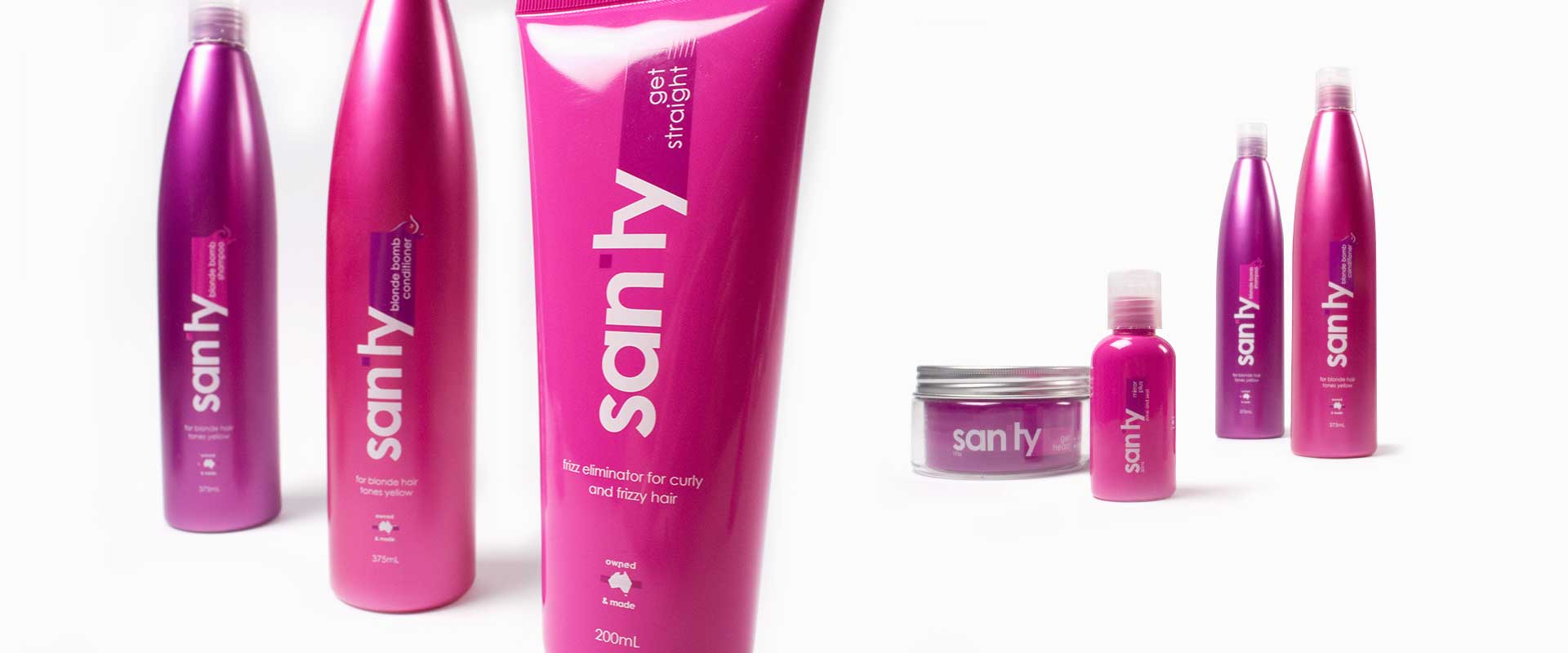
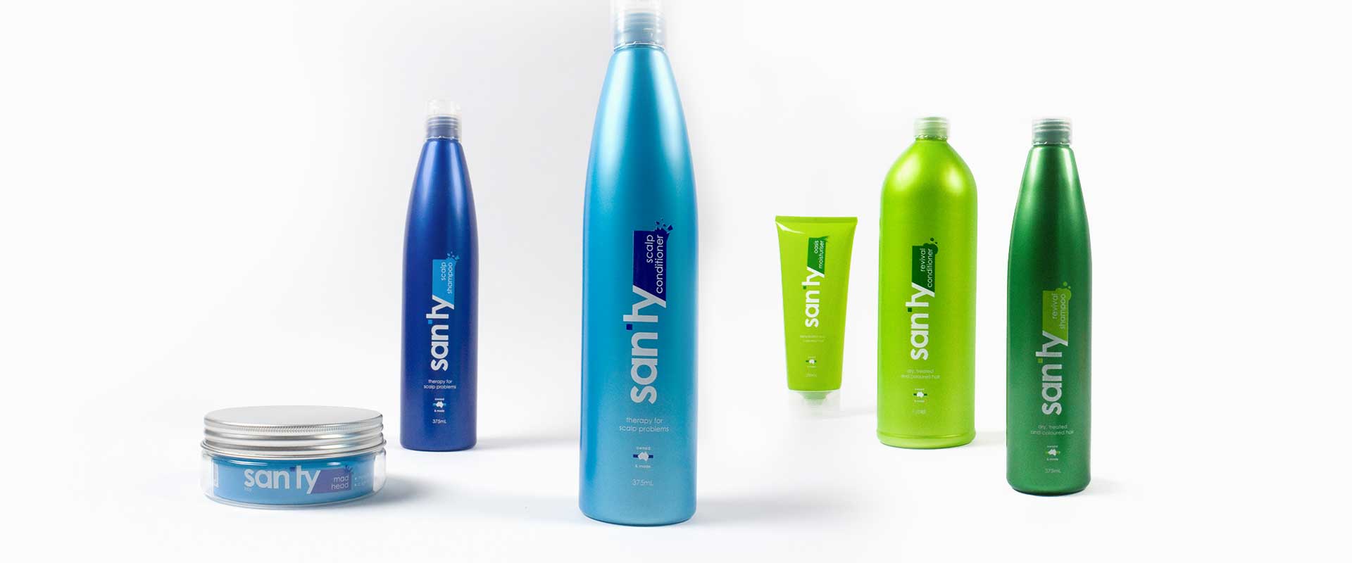
Sanity is a retail brand of quality haircare products made by Hair and Beauty Partners in Australia.
They came to Sydney creative agency Percept Brand Design because they had great haircare products that were underachieving in their retail environment. It was soon determined that they were in the need of new branding and packaging design.
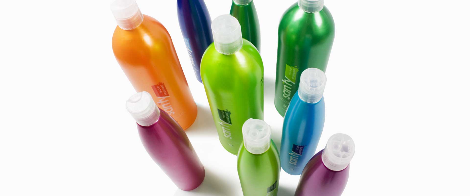
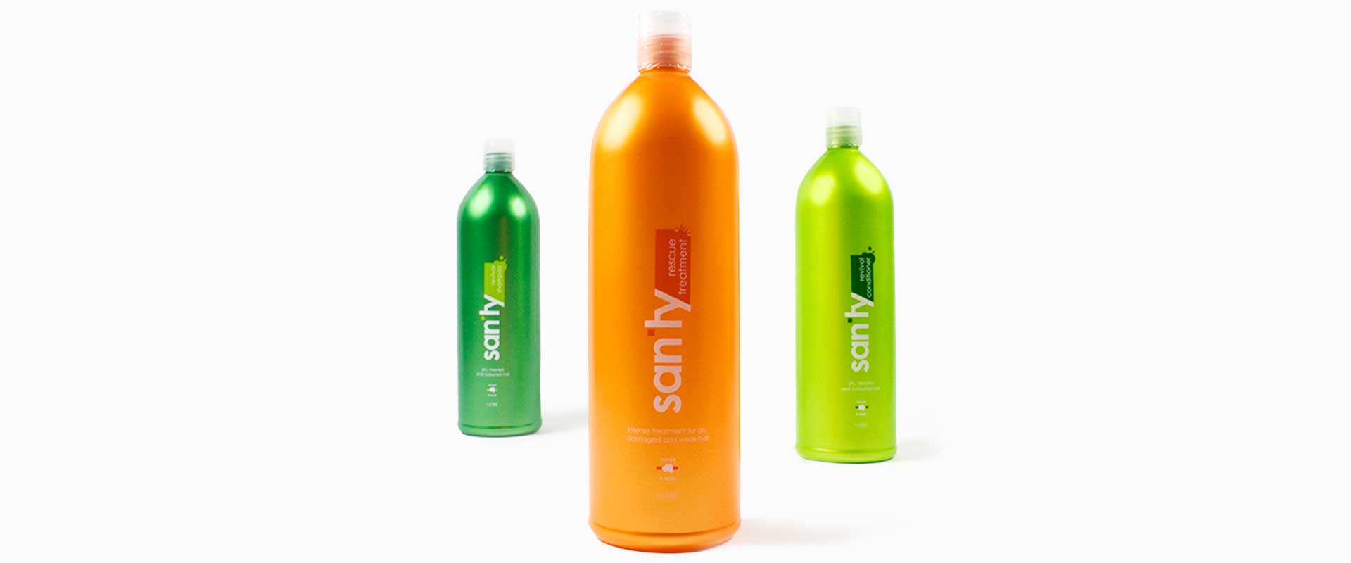
Sanity requested an eye catching redesign to reinvigorate their branding and packaging design, giving it a strong and vibrant shelf presence that would appeal to their young target market of 15-30 year olds.
Percept strategically opted for a simple design with bold colour on this branding and packaging design project, to maximise shelf impact for retail sales.
Each different haircare product is colour coded according to its use, and the products when viewed together, form a very strong set with a great in-store presence in their retail environment.
The redesign of the brand logo itself, is clean and contemporary which will appeal to their desired youth market. Depending on each variant, the corner is slightly modified to indicate the purpose of that particular product.
This branding and packaging design project gained design industry attention when it featured in Packaging News magazine and the Packaging Of The World and Dieline blogs.